Blimey! has had a few logo changes since I started this blog in December 2006. Originally I just used a font that Blogger provided, but that tended to look quite dull for something as bright and colourful as a comics blog so in 2007 or 2008 I started designing my own. Here's a few of them from over the years...
2008. Better than using Blogger's template but the background's a bit empty...
A few comic covers added to liven up the background...
2009. A bolder logo...
2009, Christmas variant with snow on the logo and a few different covers in the background...
January 2011. Bigger, more like a magazine masthead, which is what I was aiming for. But the logo doesn't look 'comicy' enough...

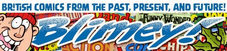
So in July 2011 I redesigned it with a logo more akin to comics. I also dropped the sub-title 'It's another blog about comics' as a few other blogs had followed with something similar so I thought an emphasis on the Blimey! logo worked better.

I've usually done a Christmas variant every year. I can't find all of the files right now but here's the most recent one from Christmas 2014...
Today I designed the latest one. This was the first version which was only up for a few hours as I felt it was lacking something...

So I tweaked it a bit. Nah, still didn't like it too much...

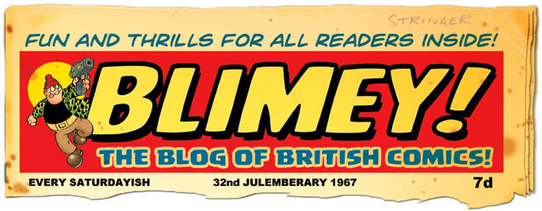
I tweaked it a bit more, added a shadow, and here's the finished result. I'm quite pleased with this one as it echoes the design of a classic British comic logo...
Most of the fonts I've used over the years are ones I bought from Comicraft. (This latest logo design is from a font called Hero Sandwich.) I know there are lots of free fonts out there (some ok, some not so good) but if you want the best professional comic book fonts, Comicraft are the people to go to. (Which is why so many comics use them.) Their annual New Year's Day font sale is still on for a few more hours (as it's still New Year's Day in some parts of the world) so visit their website and have a look around:
I hope you'll forgive the self-indulgence of this post. Don't worry, I'll be back to blogging about comics again soon!
6 comments:
I didn't realize there had been quite so many variants.I did notice the latest change before you mentioned it though. They do all deserve to be in a gallery of their own.
This us the only gallery they're getting. I don't really like blogging about the blog itself. Too self indulgent. I thought this one was worth mentioning as it's the first significant change in years. Plus it gave me a chance to plug the great fonts that Comicraft produce.
Interesting, Lew. I must admit that the new one is the best.
Thanks Sid. Yeah, this new one is finally the sort of thing I was always aiming for but didn't realise it, if you know what I mean. Admittedly it is very similar to a 1960s Beano logo but with enough of a difference to be a logo in its own right hopefully.
Now that you mention it, it does look a little like one of the older Beano logos but you don't necessarily make the connection straight away.
Hopefully it's different enough anyway, with the slight wave I put on it. That sort of comic logo, with the inner line, was mainly part of the style of DC Thomson's comics, and one I always liked so when I saw that new font I thought I'd buy it.
Post a Comment